Huckle Insights
WordPress to Webflow in less than 3 weeks for a launch


Company Overview
Huckle is a B2B SaaS company helping teams better understand product usage and behavioral insights. Their platform was technically sophisticated—but their website didn’t reflect that reality.
They were running on a templated WordPress build that limited flexibility, slowed iteration, and visually undersold the product. As sales conversations increased, the website became a liability rather than an asset.
Why Timing Mattered
Huckle wasn’t “thinking about a redesign someday.”
They were actively selling.
- Prospects were testing the platform
- The team needed confidence sharing the site
- Messaging clarity mattered for demos and trials
- The site had to feel modern, credible, and high-tech—fast
They didn’t need a long rebrand process.
They needed a focused, high-leverage rebuild that shipped quickly.
The Core Challenge
- WordPress template constrained layout and updates
- Visual design made the product feel dated
- Weak hierarchy and spacing hurt clarity
- Social proof and testimonials were underutilized
- No CMS foundation for future growth
Most importantly:
The site didn’t match the sophistication of the product.
Strategic Goals
- Upgrade perception without losing brand familiarity
- Clarify messaging across the homepage and features
- Create a scalable page system using CMS
- Give the team full control post-launch
- Complete everything in one week
The Solution
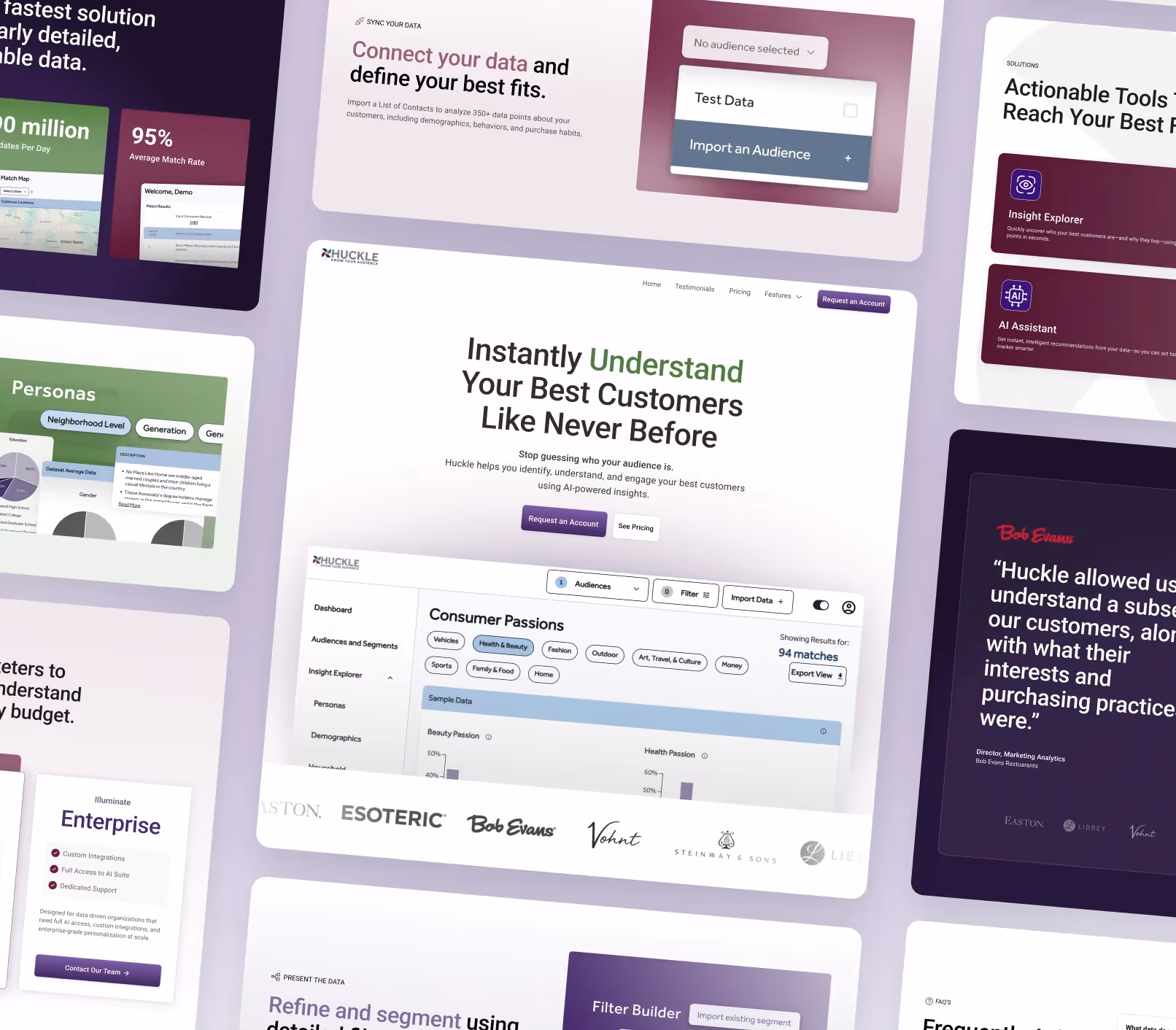
WordPress → Webflow Migration
We rebuilt the site entirely in Webflow to eliminate plugin bloat, remove design limitations, and give Huckle a platform that could scale with their product and GTM efforts.
Webflow enabled:
- Faster iteration
- Better performance
- Cleaner visual execution
- No-code updates for the internal team
Architecture First, Design Second
Using Relume, we started with:
- A clear sitemap
- Wireframes for core pages
- A “skin-and-bones” structure before visual polish
This kept the project focused and avoided over-designing too early.
Light Brand Refresh (Not a Full Rebrand)
Huckle already had brand elements—they just weren’t systemized.
We extended their existing palette and typography into a usable design system:
- Expanded color ranges for UI and emphasis
- Clear typographic hierarchy
- Consistent spacing, shadows, and UI patterns
The result felt new, but still familiar.
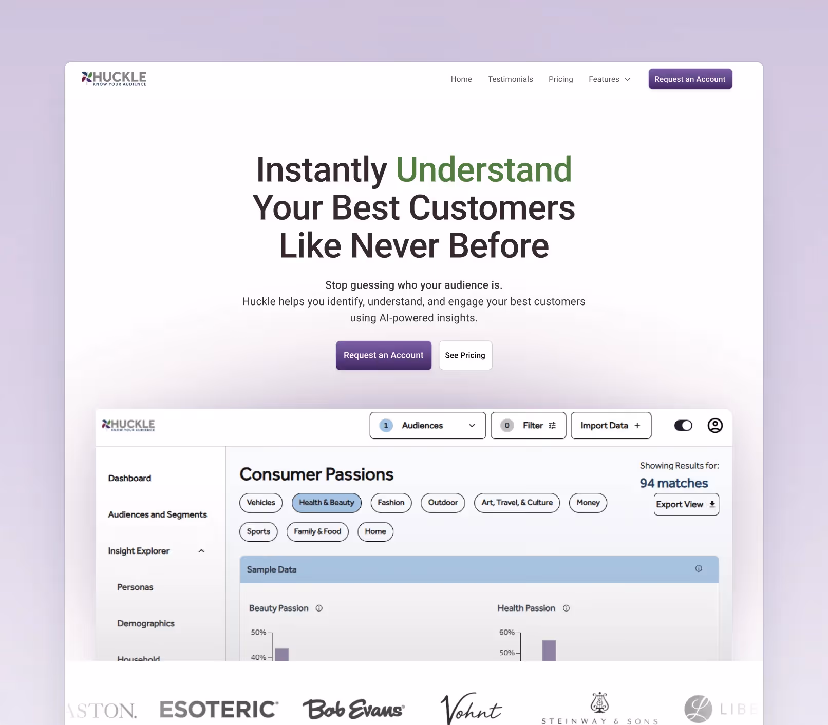
Product-Led Design Execution
We designed directly from the product itself:
- Used real in-app screenshots
- Simplified how features were presented
- Matched UI sections to product concepts
- Added subtle motion, glows, and interactions to make the site feel alive
The focus was clarity—not decoration.
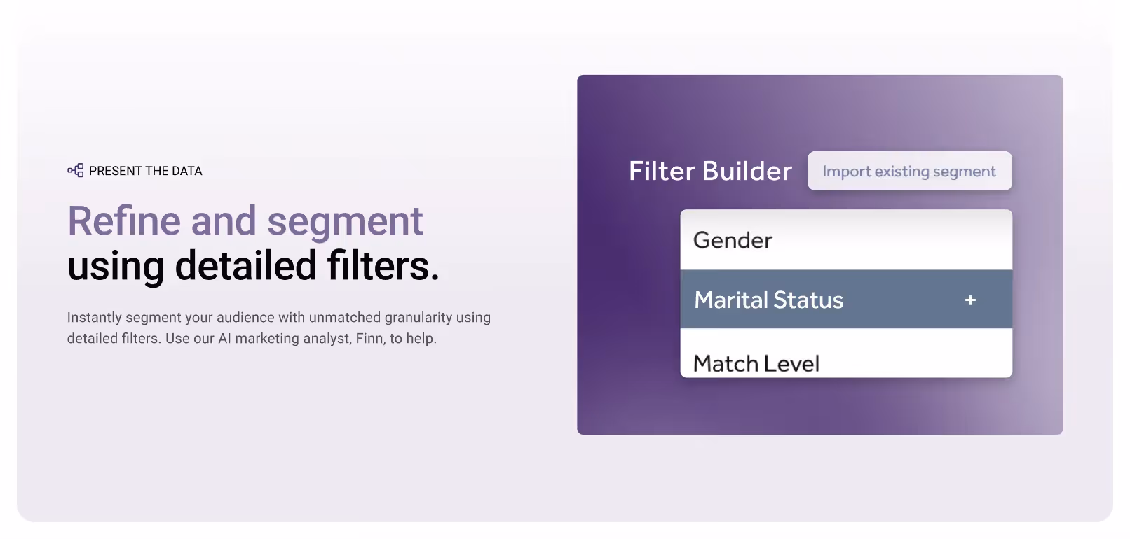
CMS + Templates for Safe Scaling
Before handoff, we:
- Built CMS collections for future expansion
- Added pre-styled Webflow templates using Relume components
- Ensured responsiveness across all breakpoints
The team can now add pages and sections without breaking design or layout.
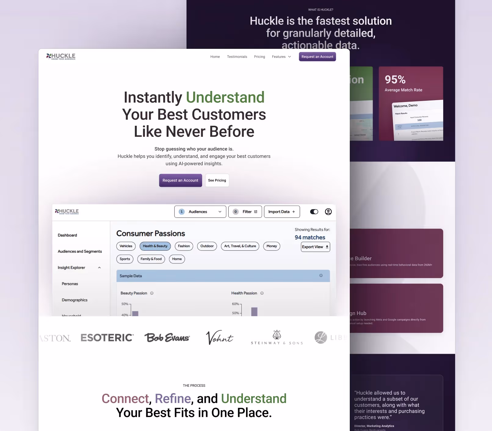
Visual Callouts
- Old WordPress homepage
- Sitemap & wireframes
- Feature page redesign
- Webflow CMS templates
- Interaction & animation highlights
Outcome & Impact
- Launched in under one week
- Clearer messaging across the site
- Modern, high-tech look aligned with the product
- Increased internal confidence sharing the site
- Faster GTM execution with no developer bottlenecks
As Andrew put it:
“We wanted the website to match the sophistication of our platform—and now it does.”
Closing
Huckle didn’t need a bloated rebrand or a patched WordPress refresh.
They needed a modern platform, clear messaging, and a site they were proud to share.
"Clearer message, cleaner website, and a high-tech feel that reinforces confidence."
View more success stories
"Stronger engagement, faster onboarding, and increased interest across our entire online brand."
